Lawbrook
Visual Identity for a specialist advisor in global financial markets
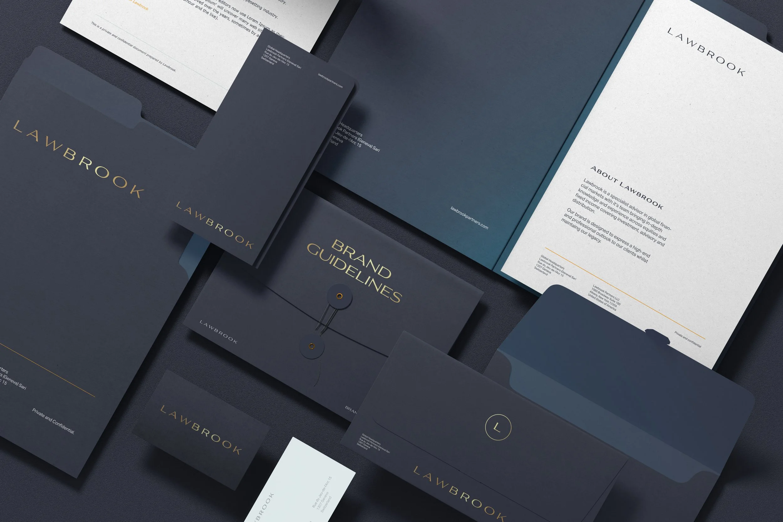
Lawbrook is a global search and advisor firm based in Switzerland, Geneva, which has been operating for over 10 years, serving their high profile clients. They are a discreet, client-driven partner to leading investors, hedge funds and trading houses across asset management and commodities.
The premise of this project was to refresh their visual identity into a more modern and contemporary mark as well as building out the brand collateral and showing how the new identity can be reflected for a new website. Their new brand has been crafted to express a high-end and professional outlook to their clients whilst maintaining their legacy.
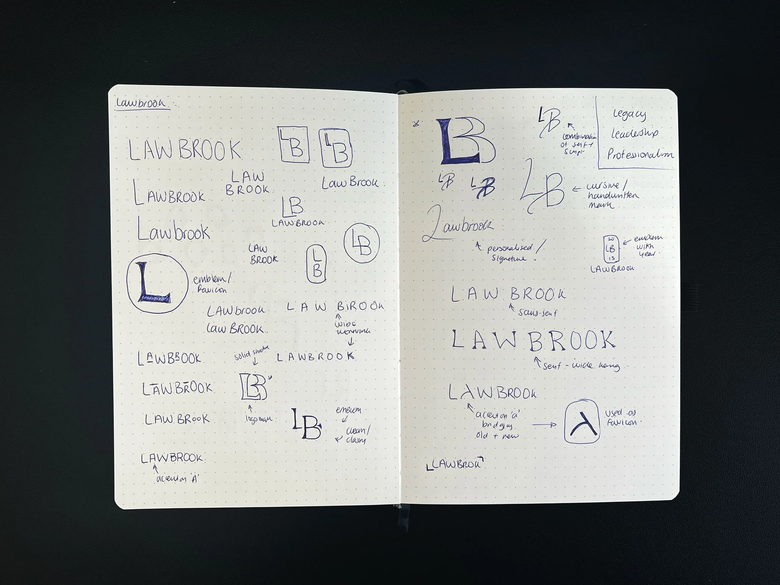
Logo Sketches
The Process
Brands Core Values:
Legacy
Leadership
Professionalism
These core values have been reflected in the visual identity through the font selection for the wordmark and the colour palette.







Brand In Action
During the development of the brand, it was important that their previous clients has some recognition with the brand. To bring this element in, I’ve decided to keep the midnight slate and introduce a orange/gold as an accent colour to help elevate the overall look of brand and to give it a more modern feel.
As part of the brands visual language, I have introduced two subtle gradients that can be used for collateral design to create a more dynamic feel rather than the brand falling flat. As the brand is typographically led, I’ve used the accent colour to highlight dividers and full-stops in headings and subheadings.
As a gold print colour falls flat during the print process, I’ve introduced a gold foiling technique for any printed materials, such as notebooks and business cards to elevate the brands printed collateral so it maintains is premium brand aesthetic.
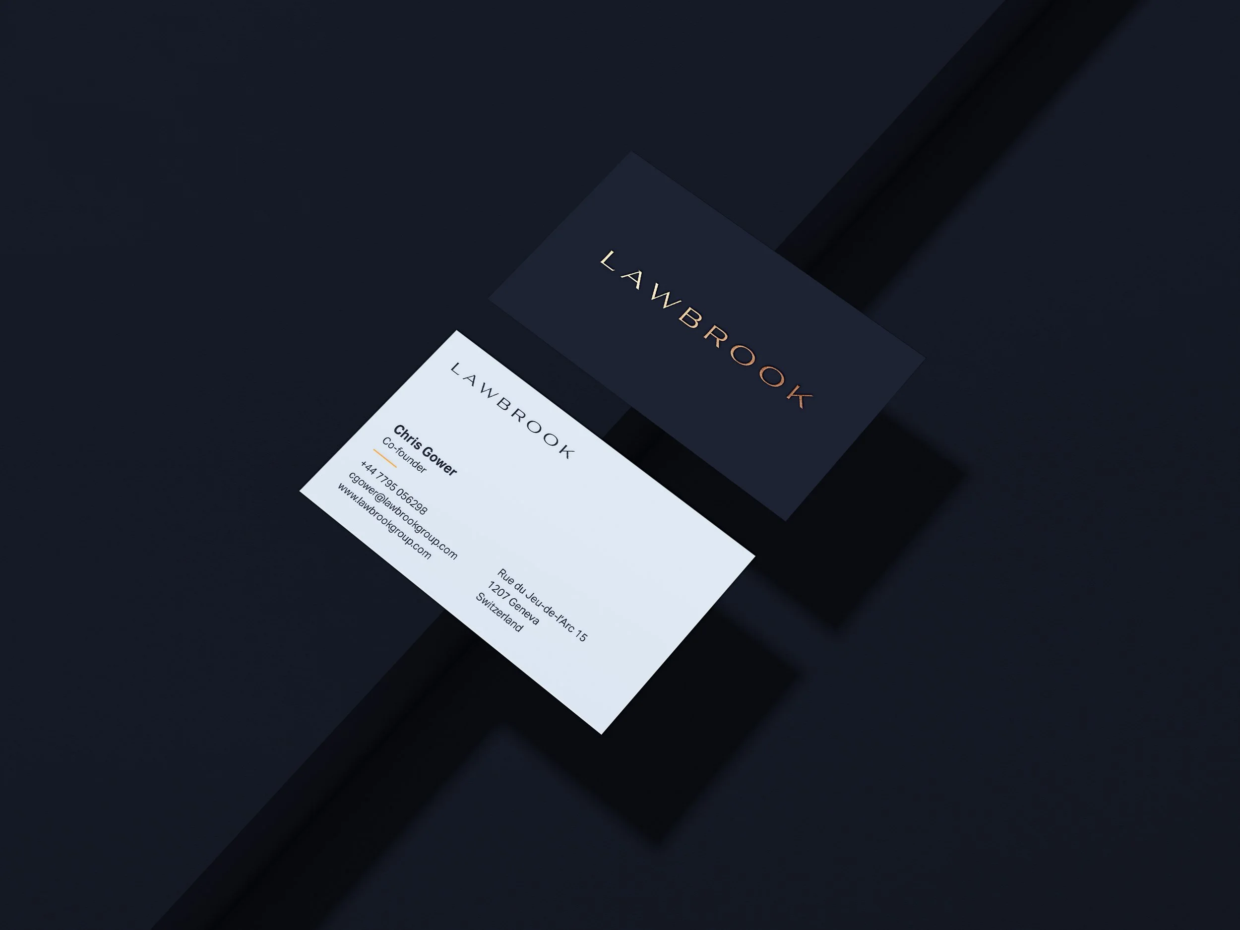
Lawbrook Business Card
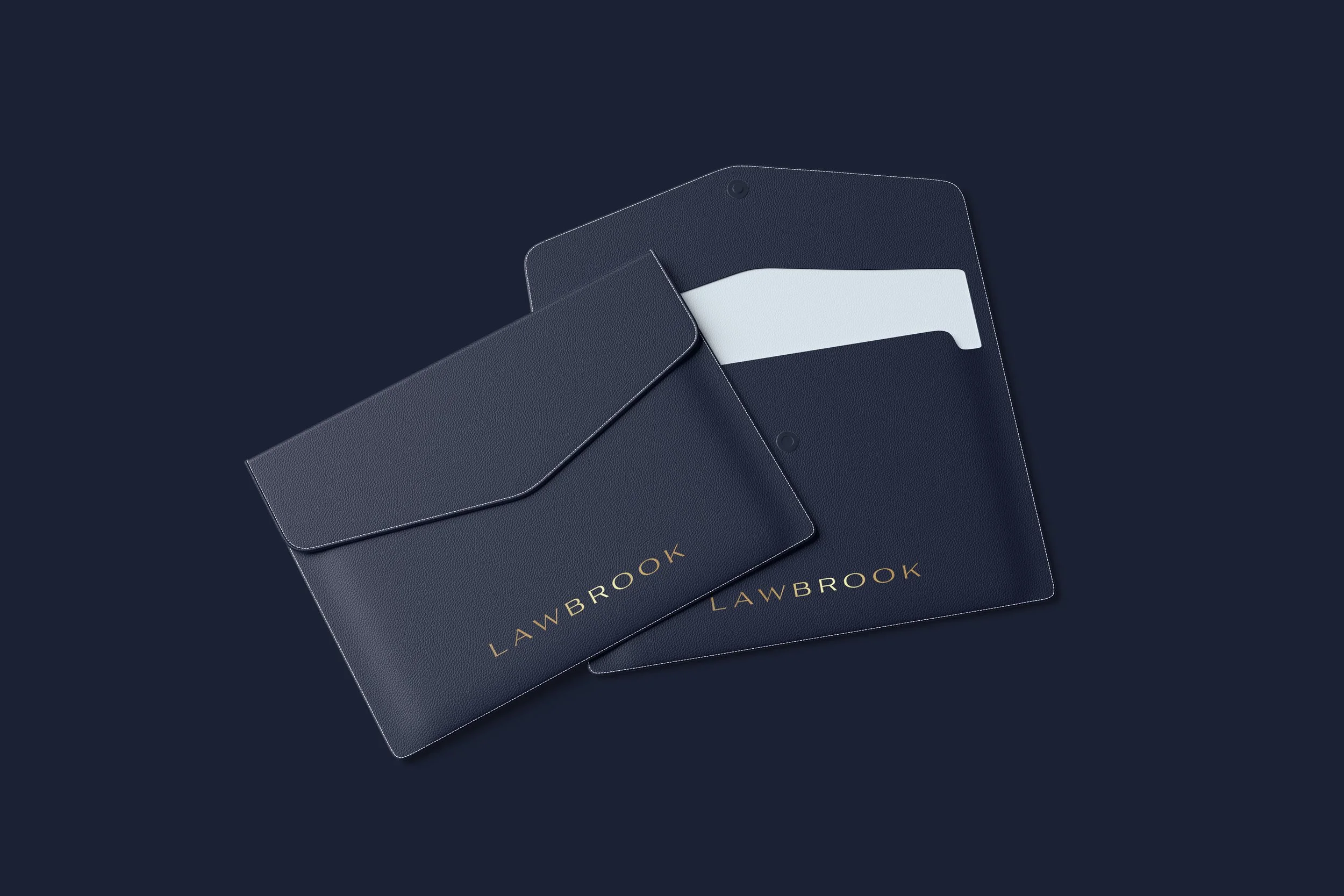
Lawbrook Leather Wallet
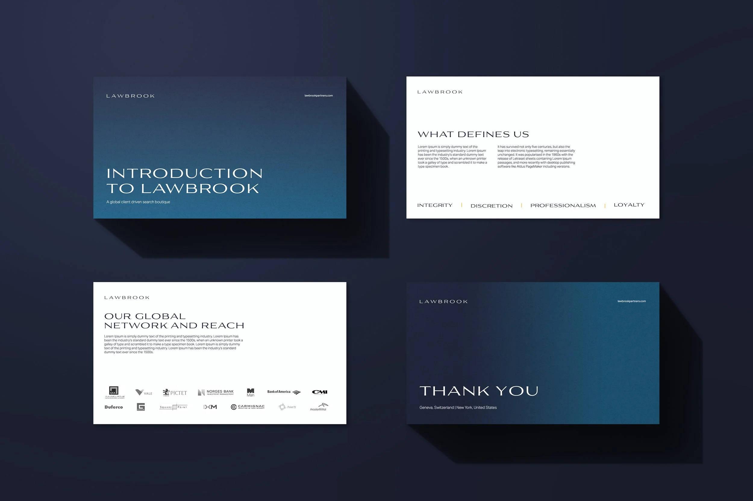
Lawbrook Presentation
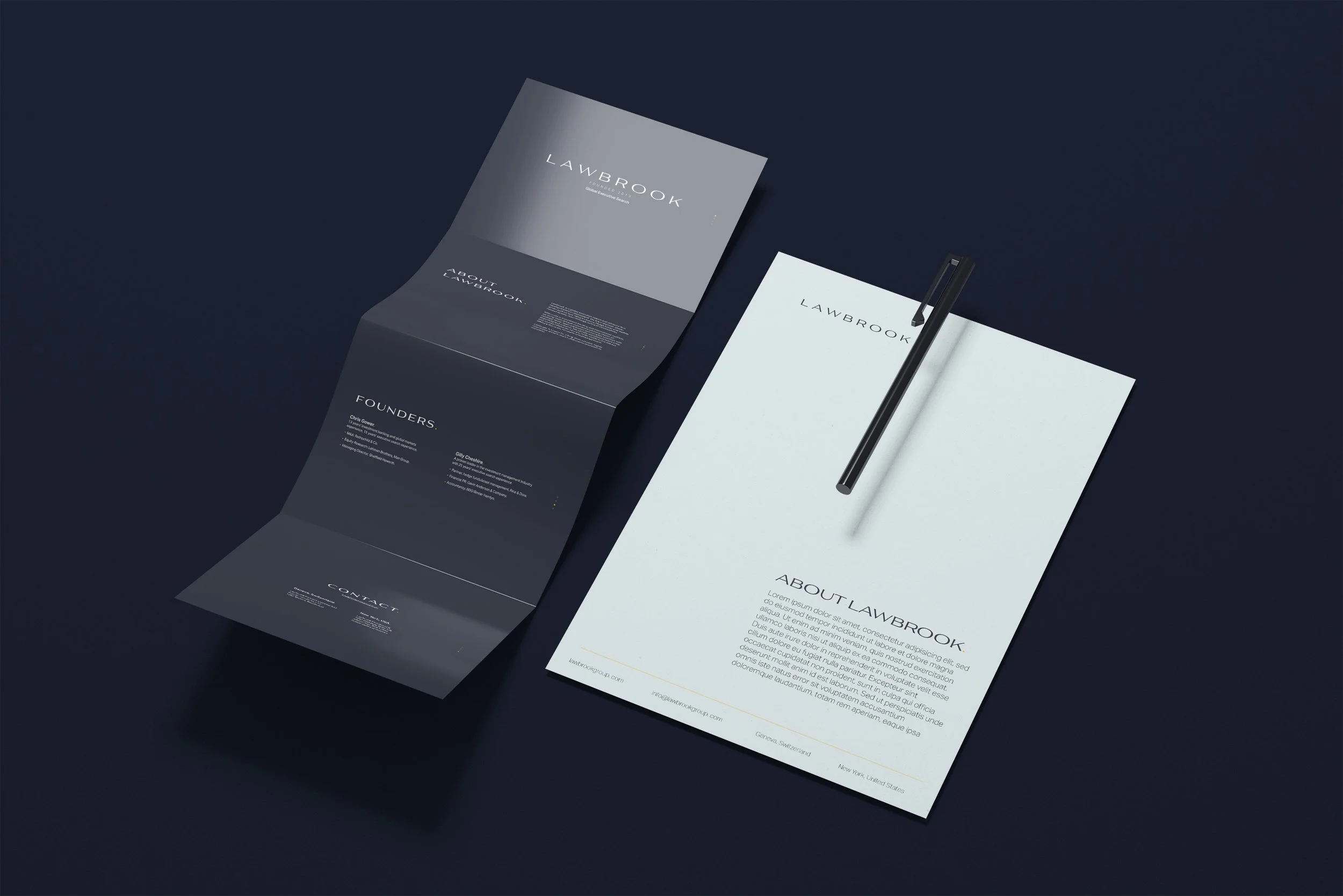
Lawbrook Print Collateral
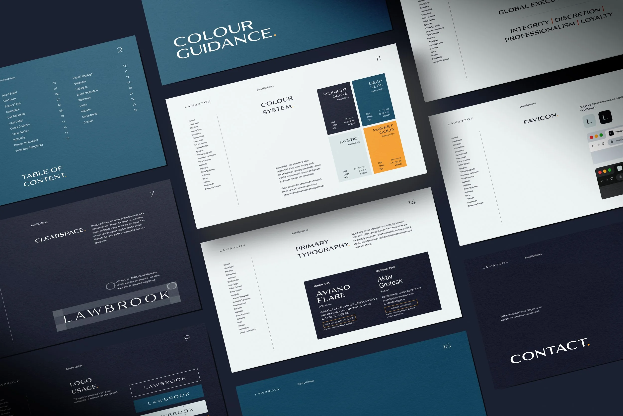
Lawbrook Brand Guidelines
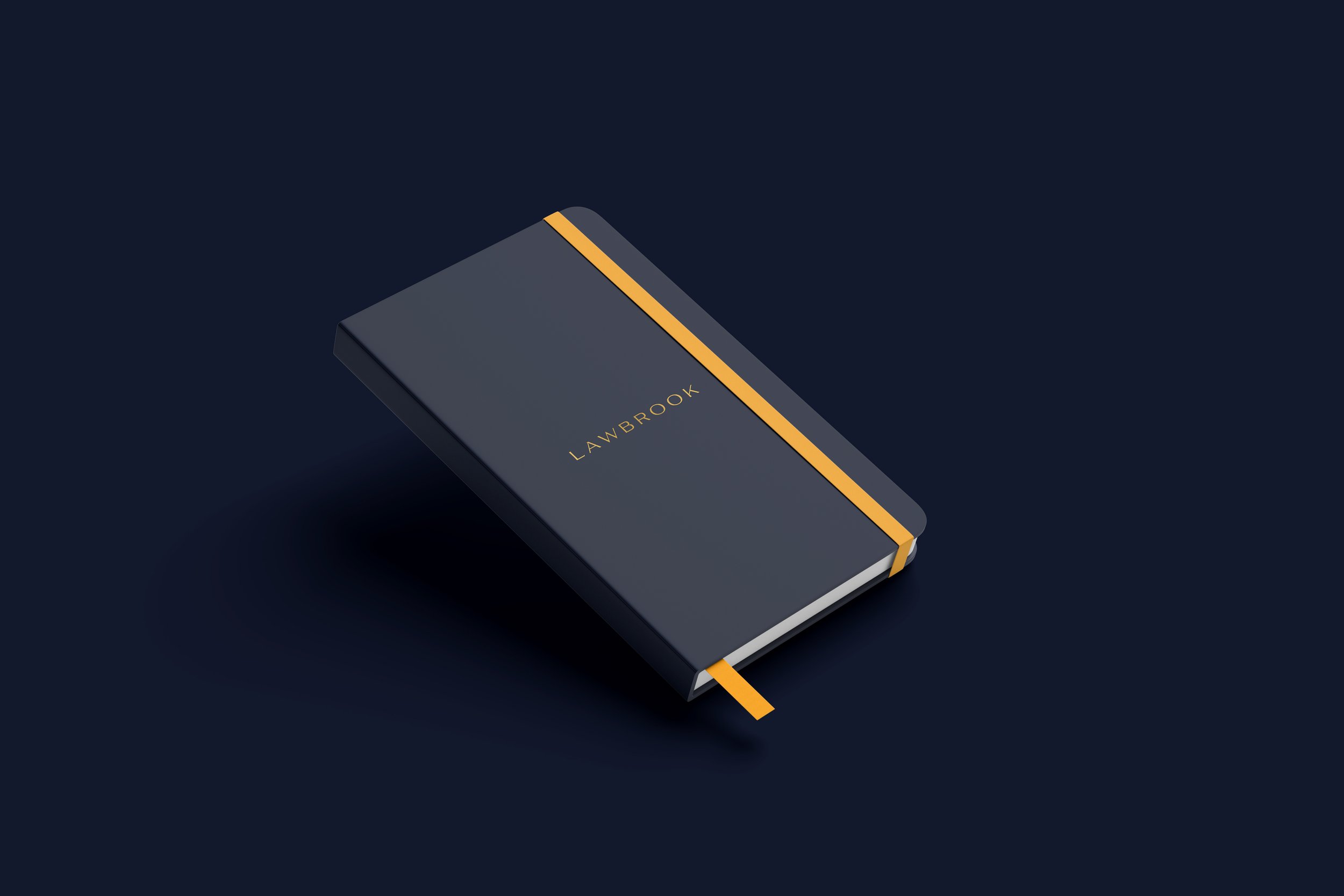
Lawbrook Branded Notebook
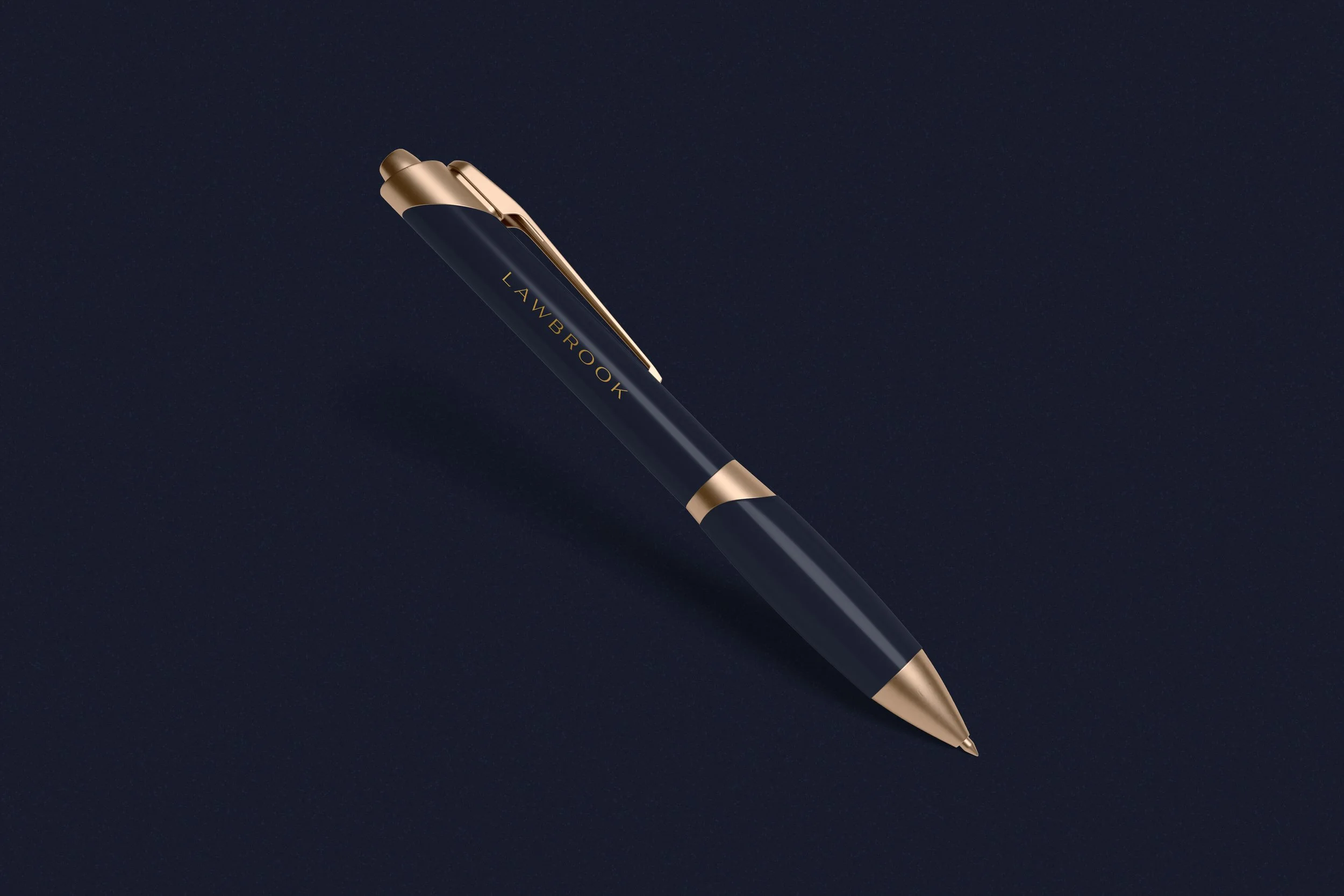
Lawbrook Branded Pen
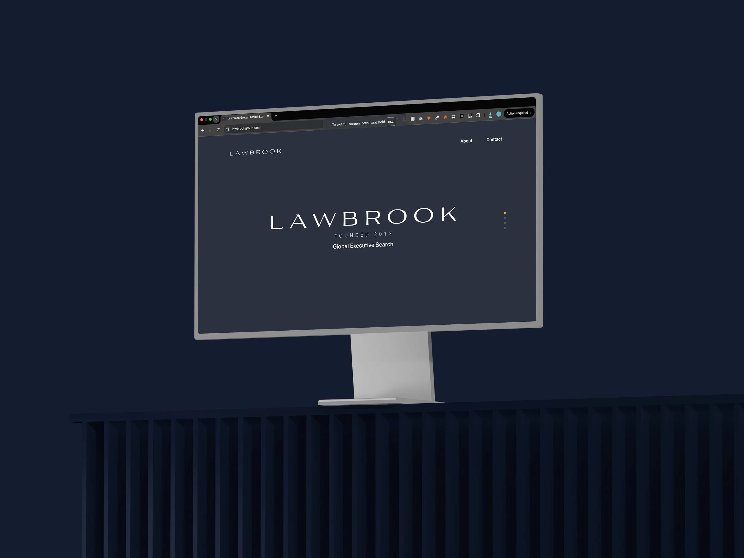
Lawbrook Desktop Website Design
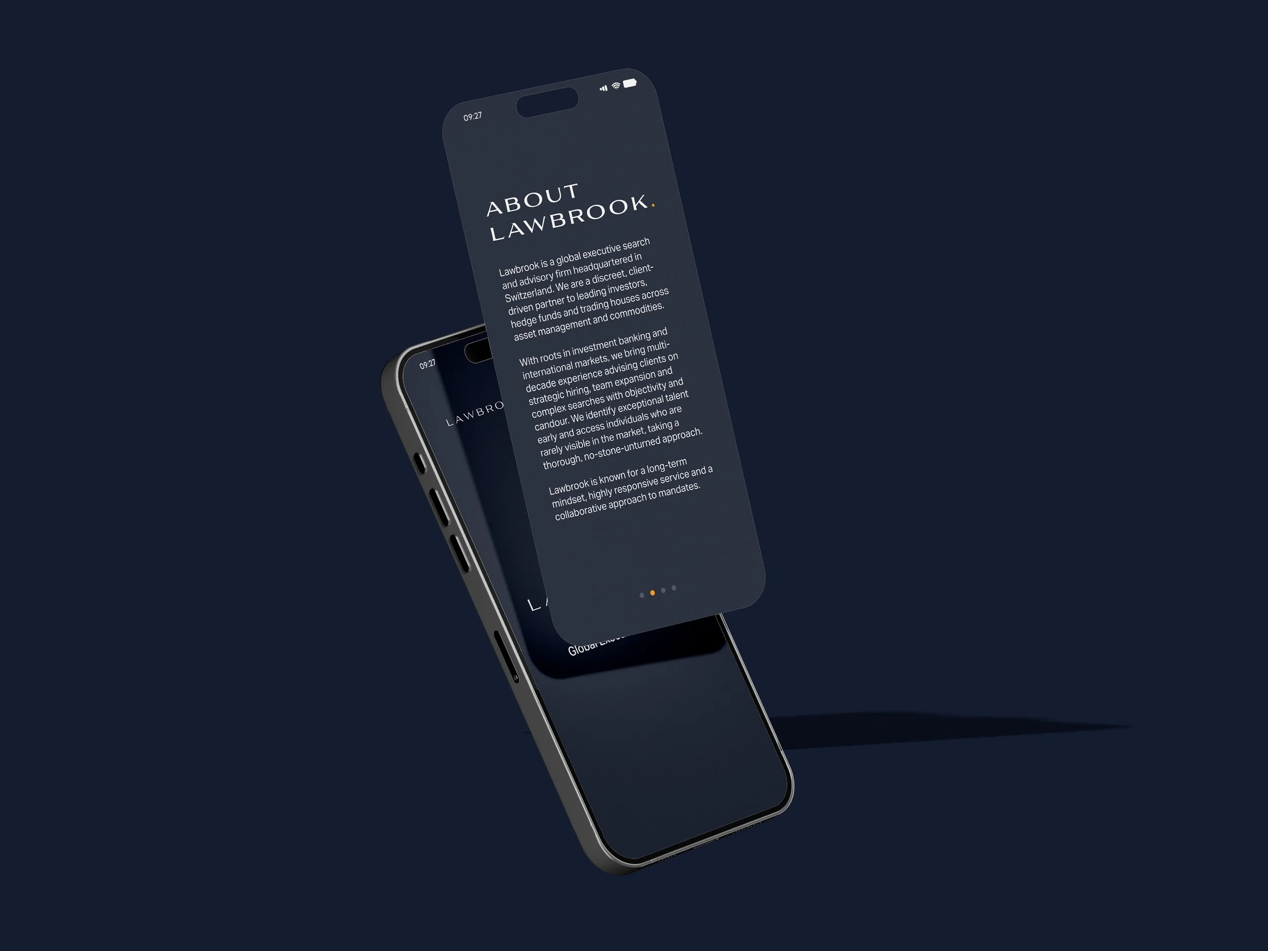
Lawbrook Mobile Website Design
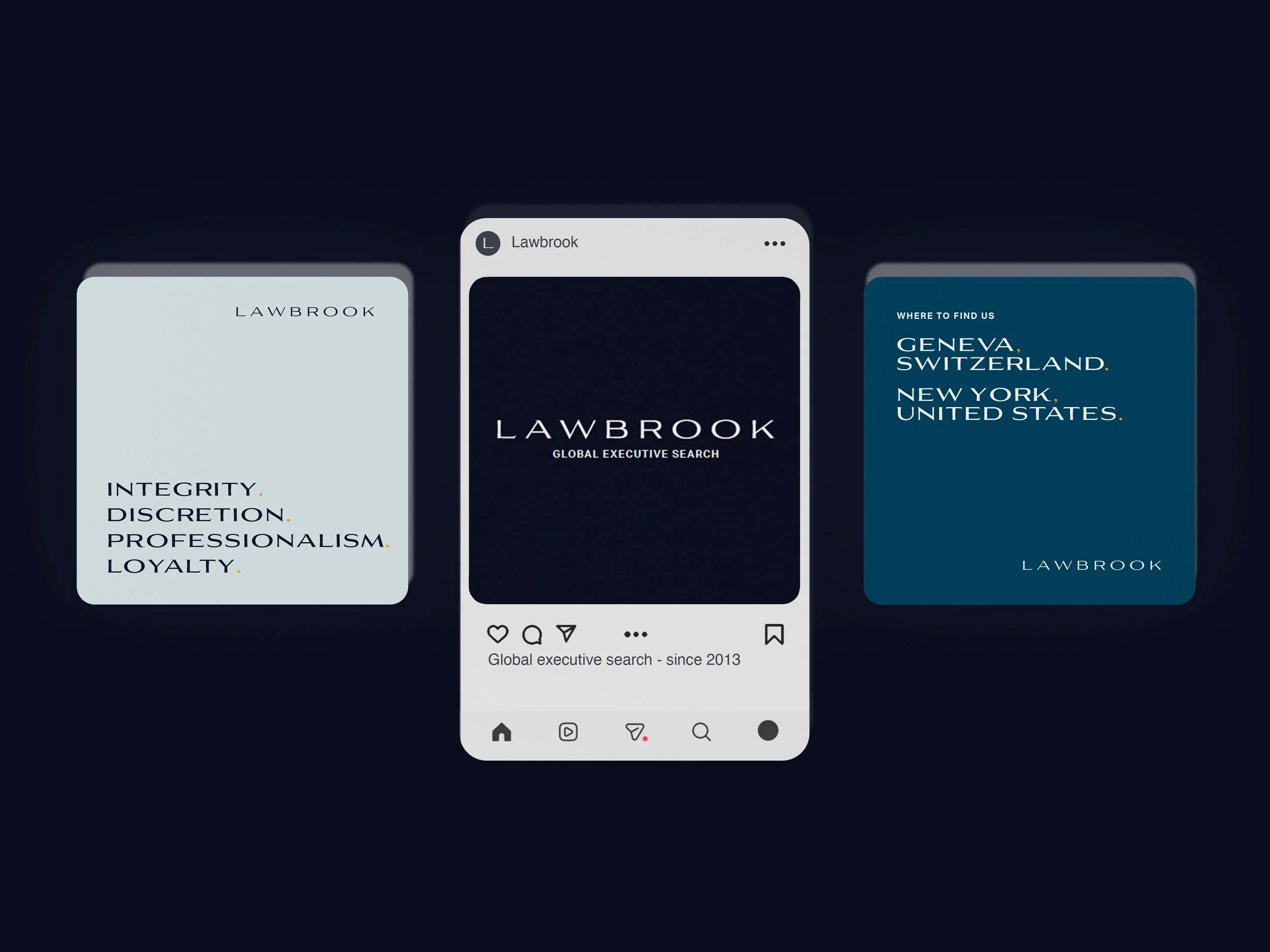
Lawbrook Social Media Post