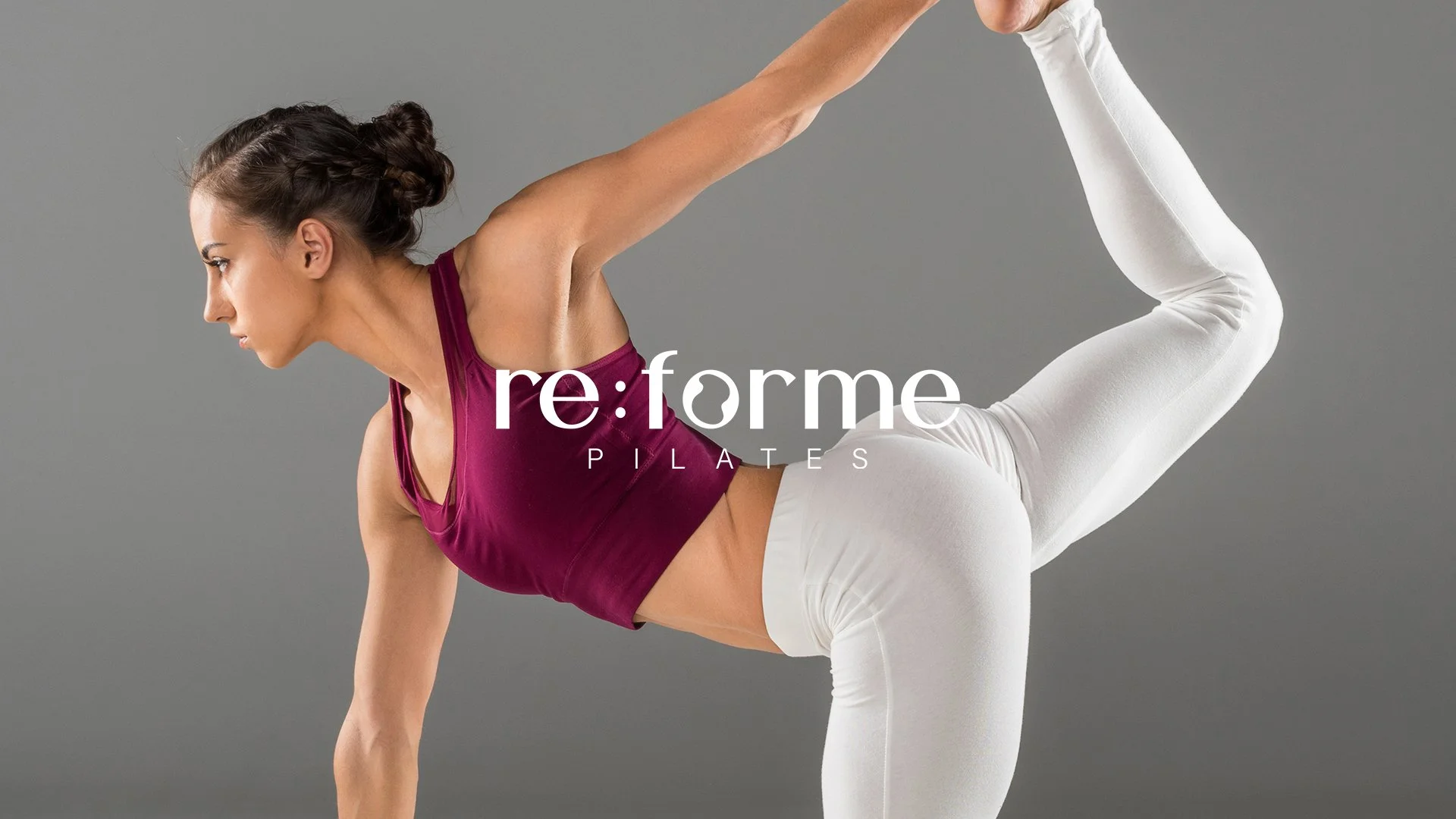
Re:forme Pilates
Brand Identity and Website Design for an Pilates studio in Oxford
Re:forme pilates is a specialist pilates studio based in Oxford, where they teach the complete system of pilates, including; reformer, chair, tower and mat classes.
For the launch of the studio, I’ve created the visual identity as well as an optimised website, whereby both outputs adhere to the brands core values. Even thought the studio is a calm and welcoming space, we stayed away from the sage greens and beiges as they common colour palettes used for pilates studios. Instead we opted for a burgundy colour palette with soft tones and a bight accent green, which is to be used sparingly across print and digital outputs.
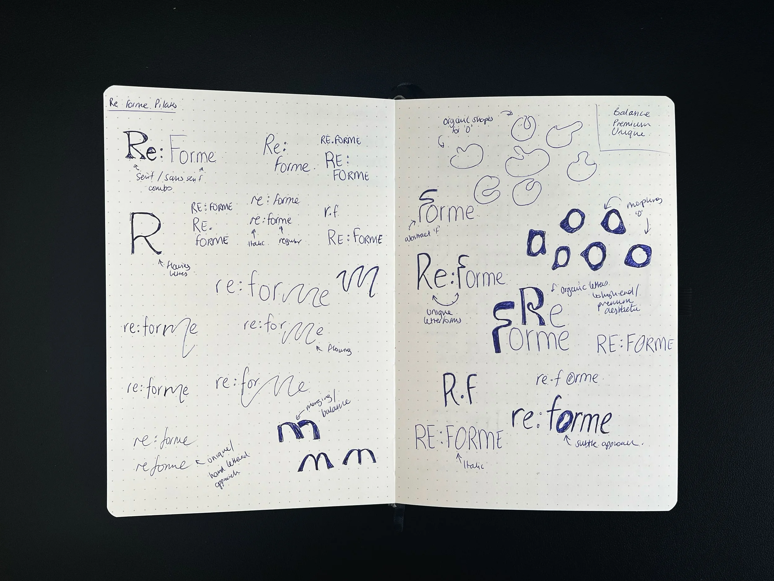
Logo Sketches
The Process
Brands Core Values:
Balance
Premium
Unique
These core values have been reflected in the brand identity as well as the website by offering users an experience which portrays a unique feel and presents itself as a premium pilates studio.
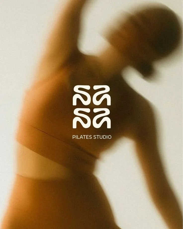
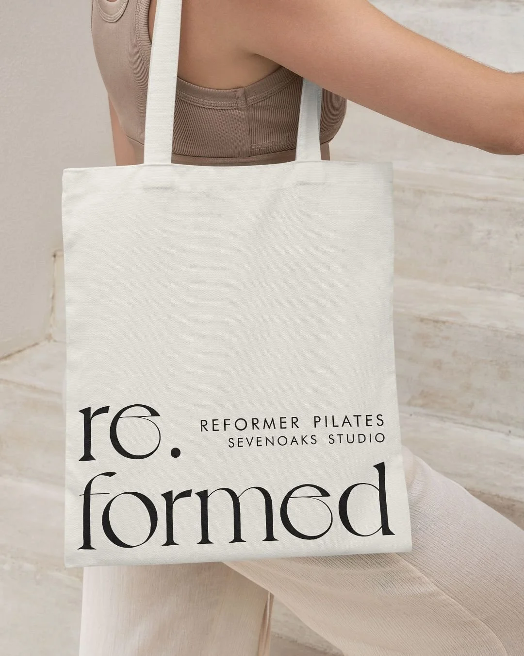







Brand In Action
During the development of the brand, a graphical device has been created using the featured ‘o’ shape in the logo. This can be used to frame image or text to add movement to the brand. Playing on this further, curved shapes can also be used to frame images and text so the centre ‘o’ shape is not overused.
The website was created in Squarespace, with a mailing list added to send out welcome newsletters and e-shots. Further to this, a booking system from mindbody was integrated, so users are able to book classes directly through the website.
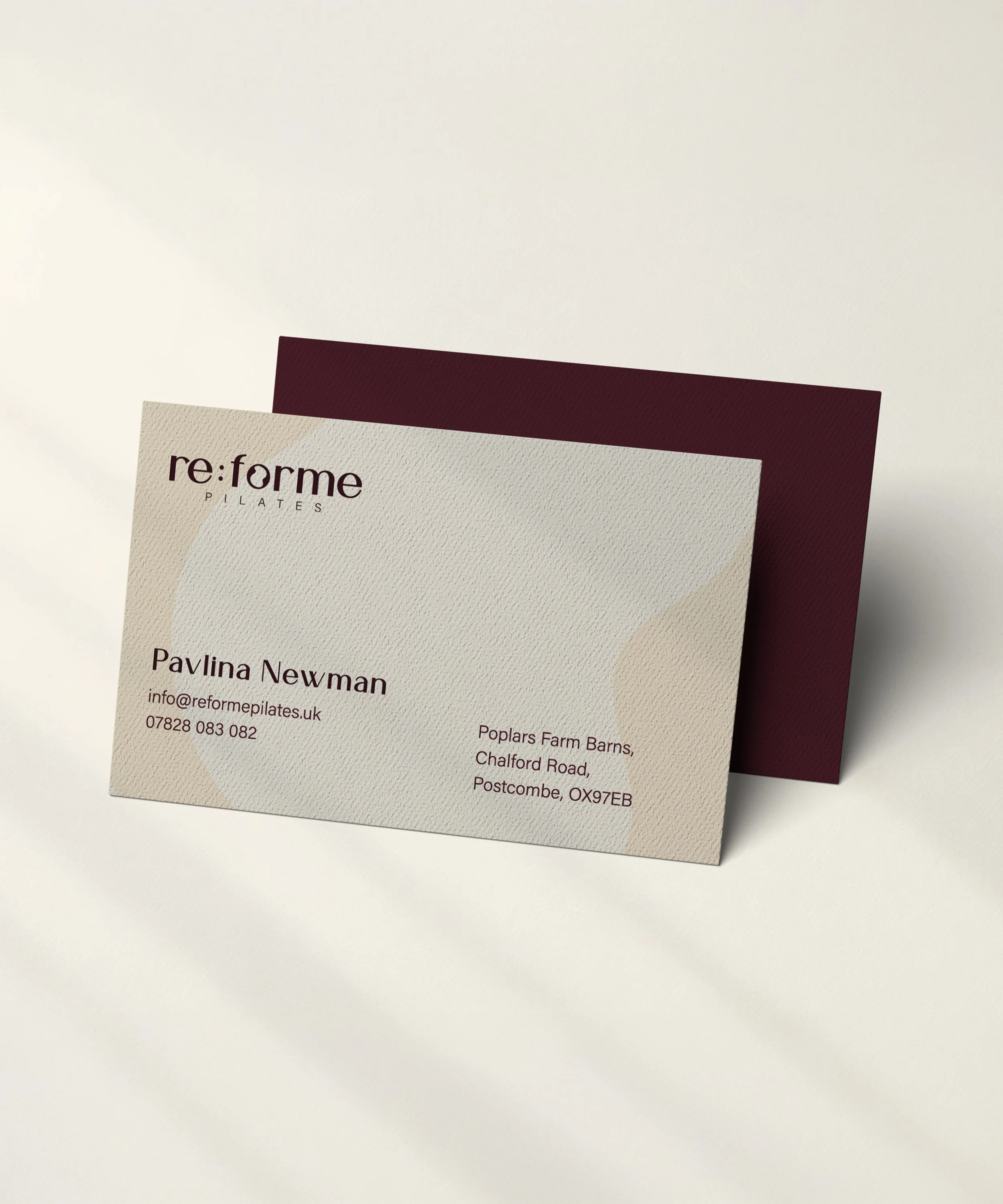
Re:forme Pilates Business Card
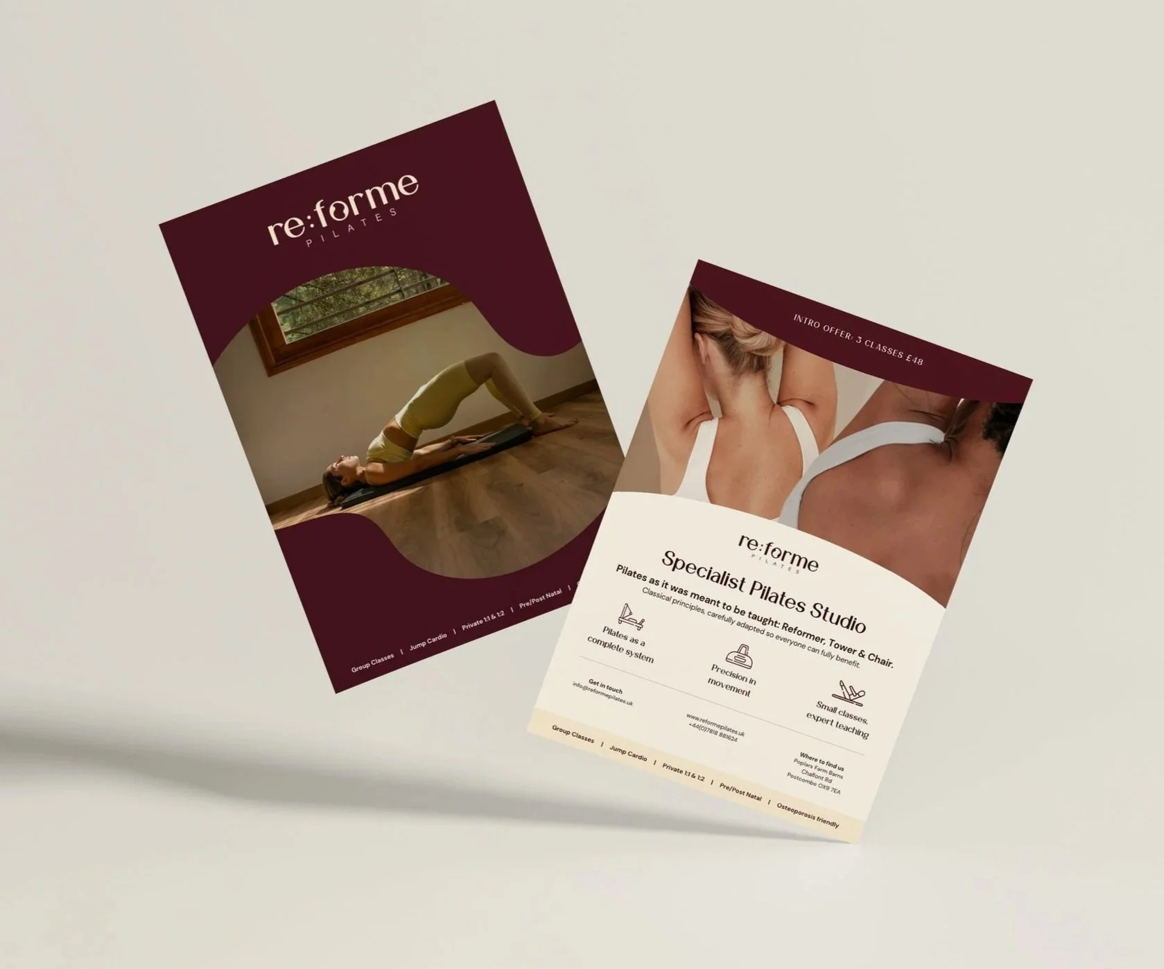
Re:forme Pilates Double Sided Leaflet
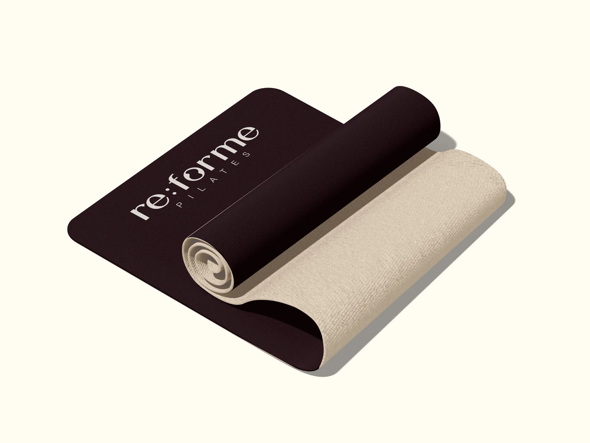
Re:forme Pilates Mat
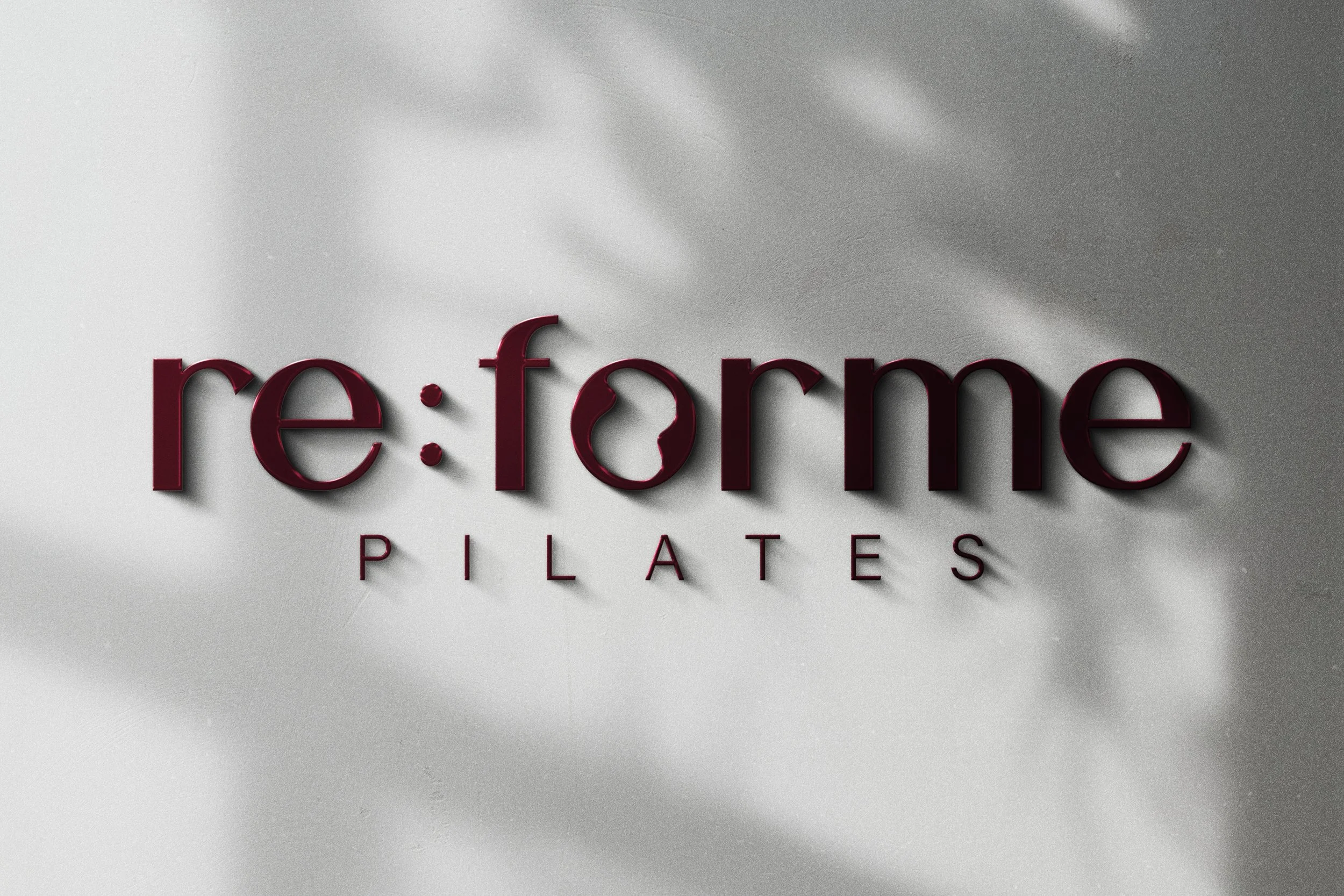
Re:forme Pilates Interior Sign
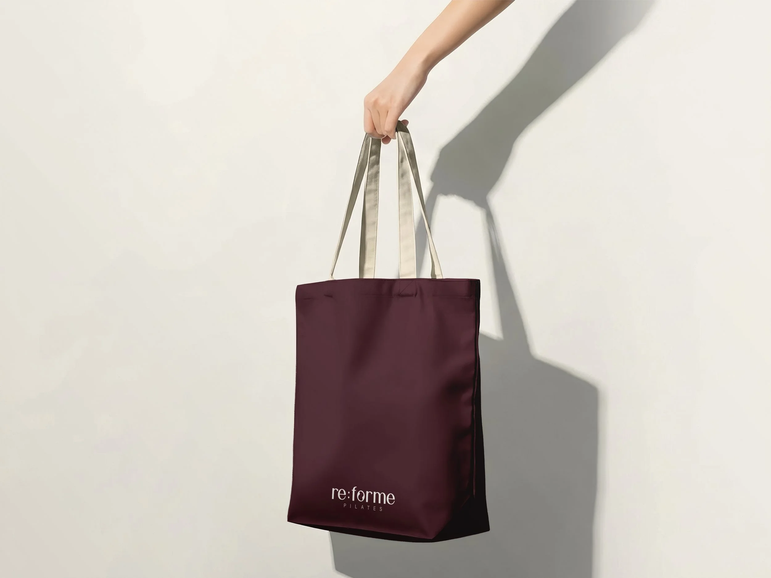
Re:forme Pilates Tote Bag
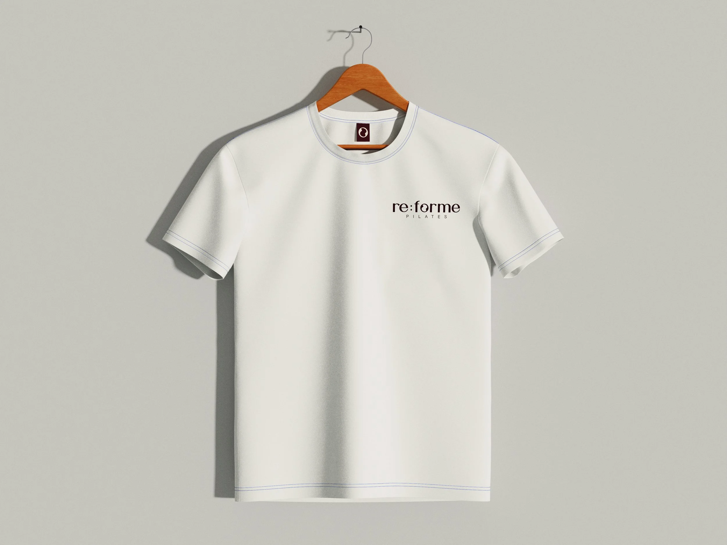
Re:forme Pilates T-shirt
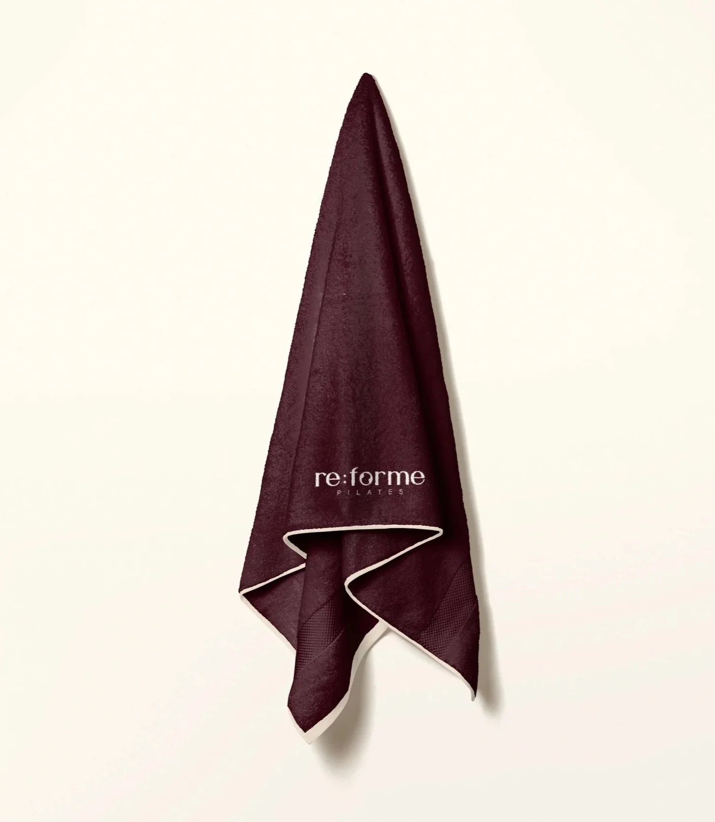
Re:forme Pilates Towel
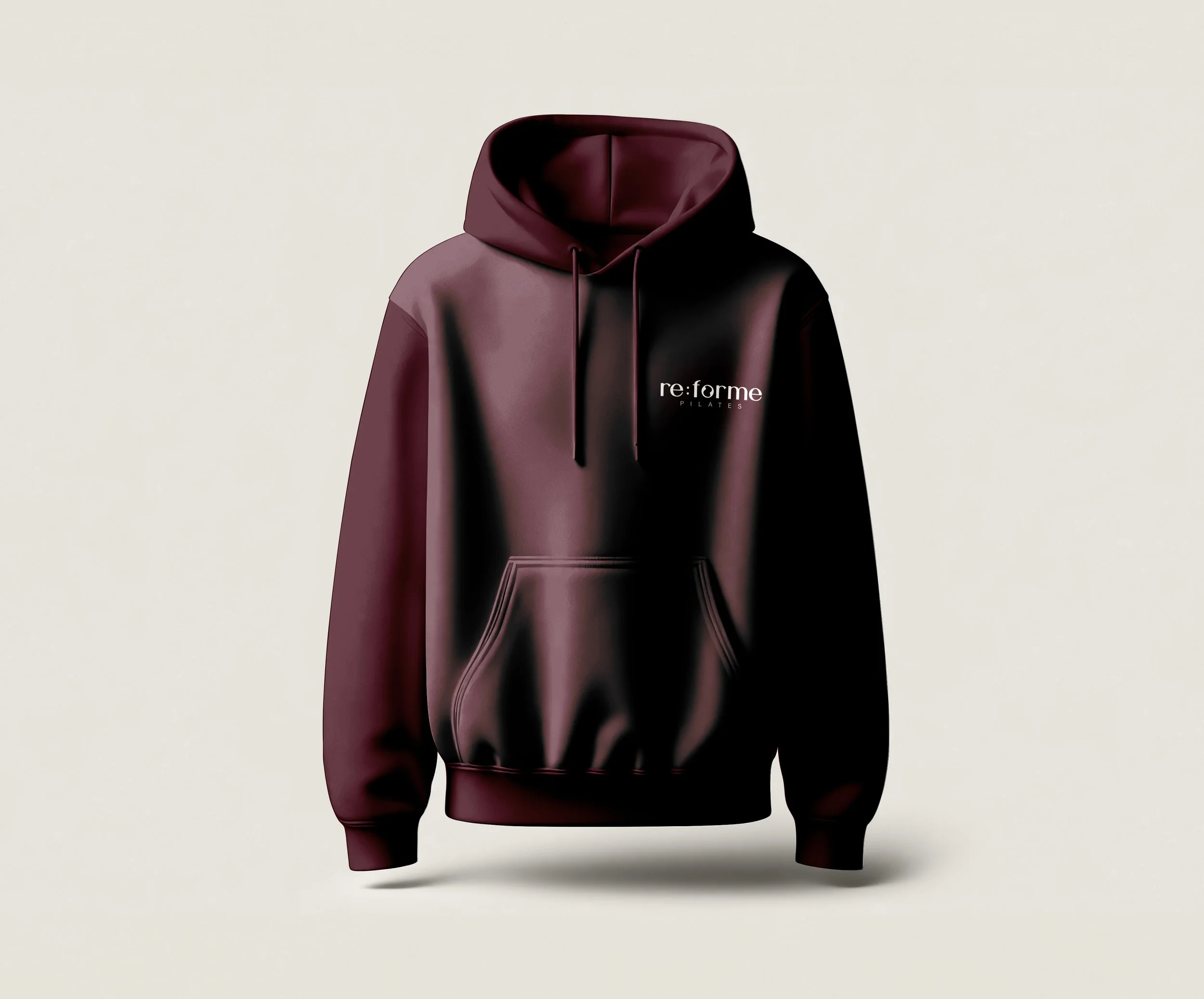
Re:forme Pilates Hoodie
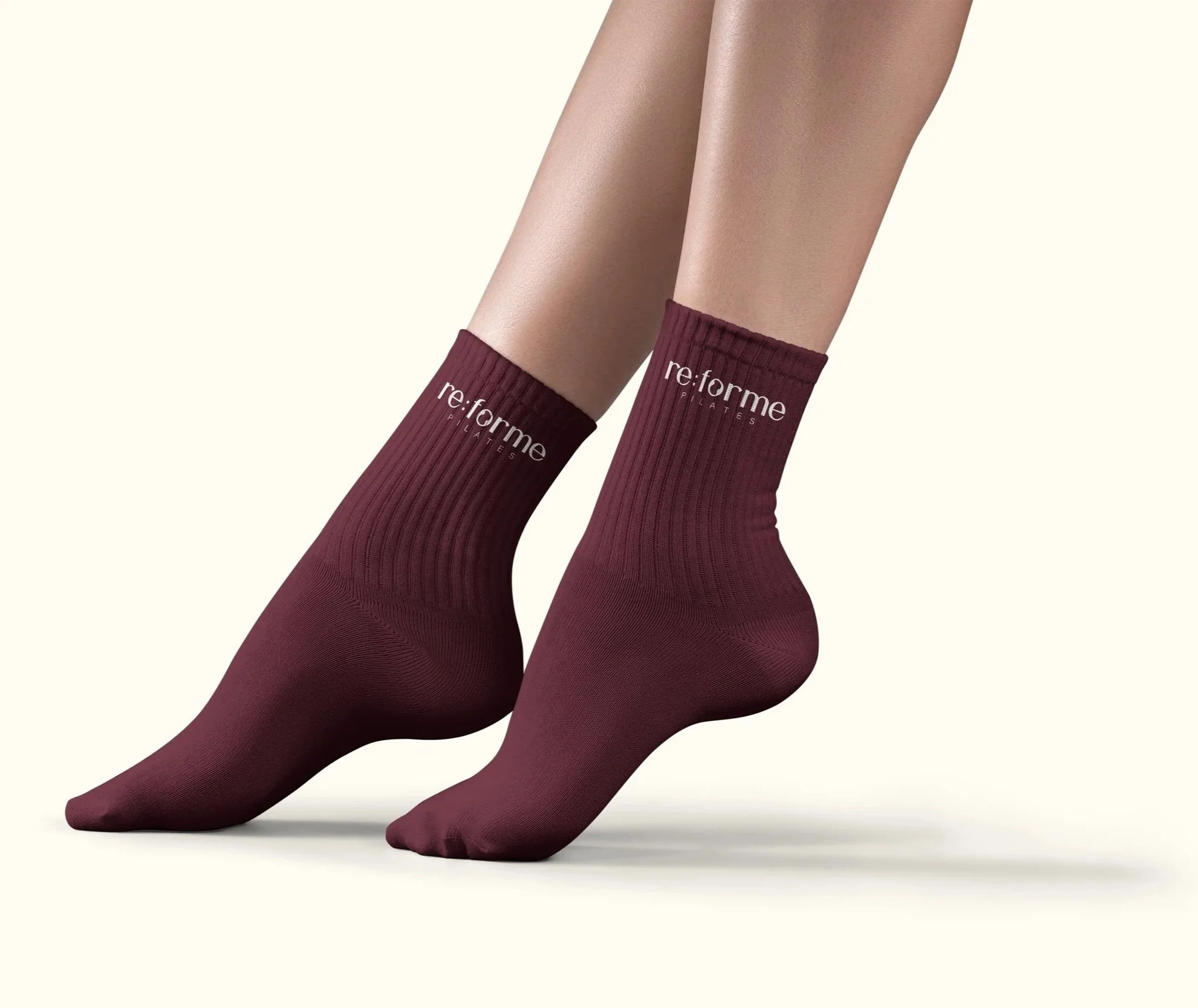
Re:forme Pilates Grip Socks

Re:forme Pilates Water Bottles
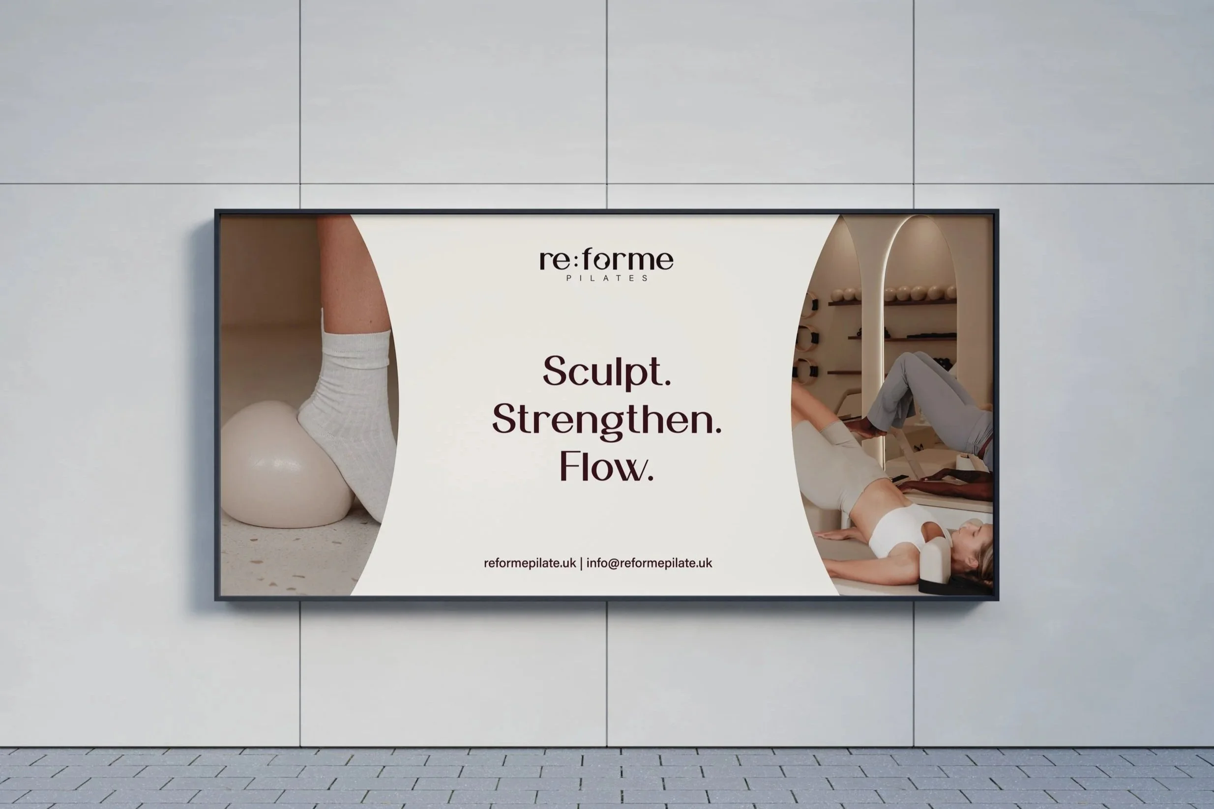
Re:forme Pilates OOH Display
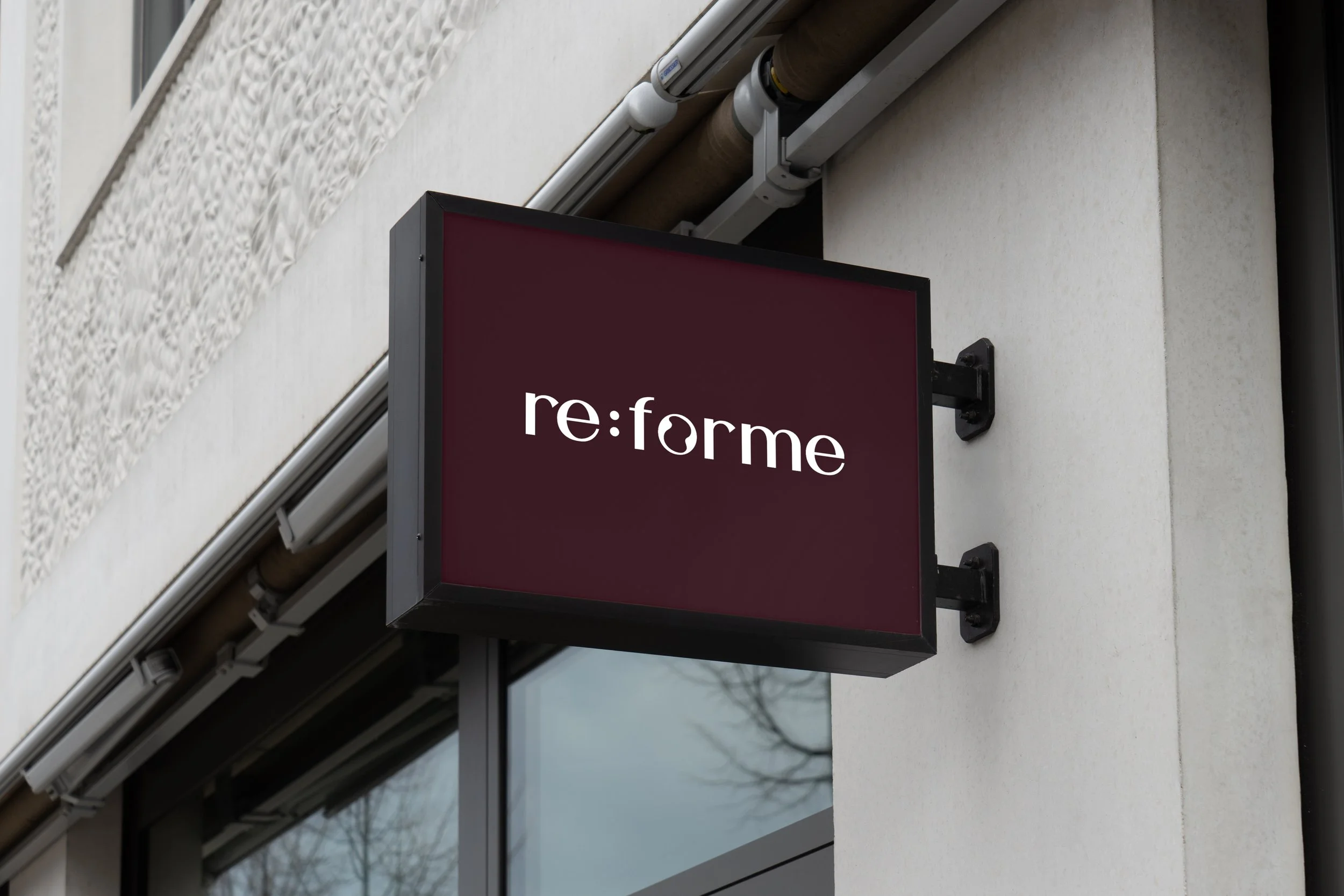
Re:forme Pilates Outdoor Sign
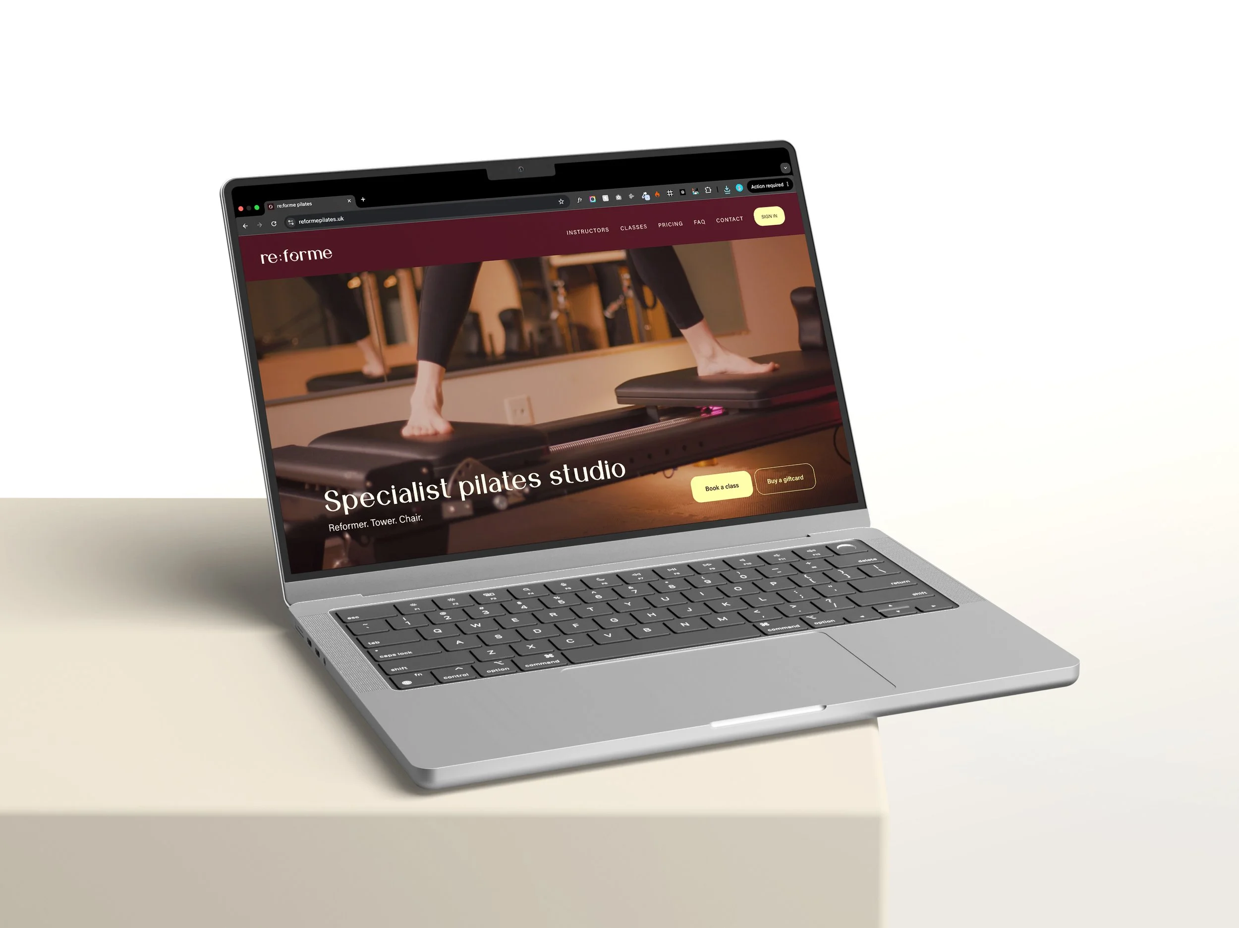
Re:forme Pilates Desktop Website
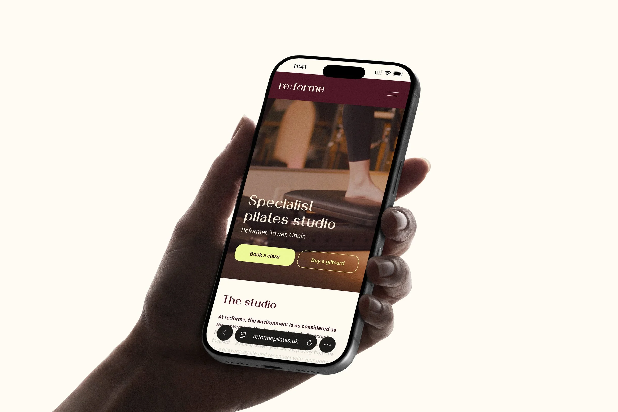
Re:forme Pilates Mobile Website
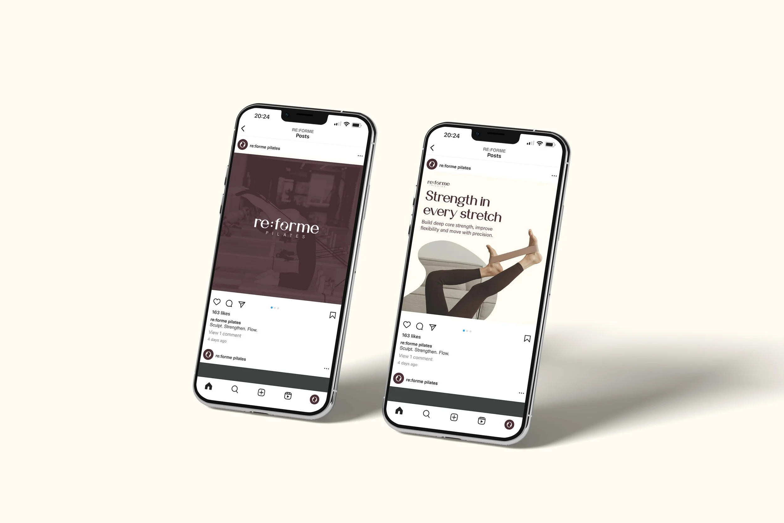
Re:forme Pilates Social Media Post